The Bias of the Original Political Compass
As a follow-up to my previous post:
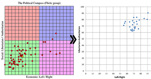
This is a visual example of the bias of the original political compass test (https://www.politicalcompass.org/):
The first graph shows the results of a Flickr group who are (presumably) “liberals” in the popular parlance. The second graph shows Democrats on my revised political compass. You can see that the original compass test is an inversion of reality.
In other words, “liberals” are not liberal, but authoritarian and right-wing on average. Just ask your average conservative and they will tell you this (though conservatives are also in the top-right quadrant, just less authoritarian).
This reddit post is correct:


